• Skip to primary navigation
  • Skip to main content
  • Skip to primary sidebar
  • Internet
    • Browsers
    • Cloud Computing
    • Online Video
    • Search Engines
    • Web 2.0
  • Mobile
    • Android Apps
    • Apps
  • Software
  • Funny Stuff
  • Social Networks
  • Web Tools

Daily Bits

  • Home
  • About
  • Archives
  • Contact
  • Advertise

Infographics

Nokia Is NOT Dead – Or Is It?

August 2, 2023 by noemi

I still remember the days when owning a Nokia 5110 was the coolest thing ever. Then the Nokia 3210 came out – or it may have been another one of those models. All I know was that back then, Nokia kept spewing out mobile phones that every one wanted to get their hands own. In my part of the world, whether people admit it or not, having the “right” kind of mobile phone is a status symbol. Many years ago, it was a Nokia. Today, I am not entirely sure what the “right” kind of phone is, but I am pretty sure it is not a Nokia. ((Yes, yours truly has a several-years old Nokia.))

The fact is that it is common knowledge that Nokia is dead. Or is it common knowledge, really? Those in the western countries – the US in particular – may not even know much about the Finnish mobile phone manufacturer anymore, but apparently, Nokia is still king of the mobile world – the Asia-Pacific mobile world. Believe it or not, they have 40 percent (well, almost) of the market share in this region. Now that I think about it, I still do see lots of Nokias here. ((Oh yeah, I do own a Nokia, old as it may be.))

Don’t believe me? Check out this infographic below from InnerActive. ((Source))

Nokia Is Not Dead

It does seem that, far from being dead, Nokia is very much alive and kicking. Does this mean that the next phone I get should be a Nokia or should I go ahead and finally get the iPhone? What phone are you using?

Filed Under: Mobile Tagged With: Infographics, mobile phones, nokia

Things That Happen On Internet Every Sixty Seconds

August 1, 2023 by noemi

How much time do you spend on the Internet? How often do you send e-mails? How often do you tweet? How often do you post a status message on Facebook? How often do you conduct a search on Google?

The Internet has invaded the life of the average person so much so that you (in all likelihood) cannot go a day without logging in to one service or another. Whether it’s Twitter, Facebook, e-mail, WordPress, Blogger, or what-have-you – one thing is for sure: people are constantly doing something online.

Now I am pretty sure that your curious mind has wondered – at least once – just how much is going on online at any given moment. Well here’s the answer to your question – not exactly in same terms, perhaps, but close enough. An infographic by Shanghai Web Designers ((60 Seconds)) tells you what happens on the Internet every 60 seconds – or every minute.

60seconds
This happens every 60 seconds online - click to enlarge

So…did you know that every 60 seconds…

  • more than 694,445 searches are done on Google?
  • more than 6,600 photos are uploaded on Flickr?
  • more than 600 videos are uploaded on YouTube? This translates to more than 25 hours of viewing pleasure (or displeasure, as the case may be)
  • 695,000 statuses are updated on Facebook, 79,364 messages are posted on walls, and 510,040 comments are made?
  • more than 168,000,000 e-mails are sent? So who was that again who said that e-mail was dead???
  • 98,000 tweets are published on Twitter? I don’t know if this includes RTs and @replies, though.

Pretty impressive numbers, but I think the guys who made this infographic missed one vital stat: that every 60 seconds, an infographic (or two) is published. At least that’s what my Twitter stream and Facebook feed tells me. 😉

Filed Under: Internet Tagged With: Featured, Infographics, Internet, social networking

Doctor Who? Doctor Who! Timeline/Infographic

July 28, 2023 by noemi

So many things to watch, but so little time! I will have to admit that I am one of the few who has not watched Doctor Who although I have read tons about it. Who can’t help but read/know about Doctor Who when he is everywhere online?

If you are into the series or if you are waiting for the chance to sit down and watch it (like yours truly), then here is a very useful infographic that can help you figure out some things. This timeline is created by Nathan the Nerd ((Nathan the Nerd)).

Doctor Who Series Timeline

Click for a larger image. I don’t need to tell you that there are spoilers up there, do I?

Filed Under: General Tagged With: Doctor Who, Infographics, TV shows

The Evolution of Email

June 28, 2023 by franky

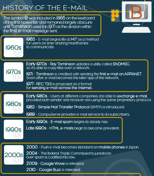
Ever wondered how long email has been around and how old the @ sign is? Our friends over at the Blog Herald sat down together with the crew of Infographiclabs and analysed the evolution of email. The result was another awesome infographic and looks at the history of email, how email functions, the spread of spam and some daily numbers for email.

I bet you all knew that Brazil the main spam provider is, followed by the USA, and not China?

In the teaser image below, a short timeline of the history of email. View the complete infographic over at The Blog Herald.

Filed Under: Internet, Web Tools Tagged With: email, Infographics, timeline

The Rise of The Yen

June 17, 2023 by franky

In times of recession, although some claim that the recession has ended already, the strength of currencies is very important for nations to maintain their economic power. While a strong dollar can damage the revival, and make imports more expensive as well as exports, Japan and the USA and Europe have had to deal with the amazing rise of the Yen over the last months.

Earlier this year the Yen reached its strongest point in 15 years compared to the USD but the currency did not stay as high and would soon drop again. One of the problems for Japan was that half of its exports to China are invoiced in yen, thus making its products less attractive. Luckily the country did not have to look for a credit loan and the Yen dropped in value again. Even though last week nations have stepped up and announced a verbal intervention to save the Yen. We looked at how the Yen grew this strong and its history. We also compared the Yen to other international markets and looked at its market share.

With thanks to Infographiclabs for another awesome graphic.

Filed Under: General Tagged With: Currency, Economy, Infographics, Yen

The Harry Potter Franchise

June 17, 2023 by noemi

Without a doubt, J.K. Rowling has changed the landscape of the fantasy genre with the series of Harry Potter books that she came up with. The only billionaire author, Rowling has influenced popular culture with her creation. The books have received critical acclaim, and so have the movies. Of course, there will always be naysayers, but no one can contest just how influential Harry Potter is.

We’ve created an interactive infographic that gives you the dish on the books, movies, and characters of the Harry Potter franchise.

Filed Under: General, Media Tagged With: Harry Potter, Infographics, J.K. Rowling

  • « Go to Previous Page
  • Page 1
  • Page 2
  • Page 3
  • Page 4
  • Page 5
  • Interim pages omitted …
  • Page 10
  • Go to Next Page »

Primary Sidebar

Privacy Policy

Copyright © 2025 · News Pro On Genesis Framework · WordPress · Log in