• Skip to primary navigation
  • Skip to main content
  • Skip to primary sidebar
  • Internet
    • Browsers
    • Cloud Computing
    • Online Video
    • Search Engines
    • Web 2.0
  • Mobile
    • Android Apps
    • Apps
  • Software
  • Funny Stuff
  • Social Networks
  • Web Tools

Daily Bits

  • Home
  • About
  • Archives
  • Contact
  • Advertise

franky

The Evolution of Email

November 25, 2010 by franky Leave a Comment

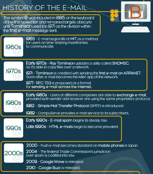
Ever wondered how long email has been around and how old the @ sign is? Our friends over at the Blog Herald sat down together with the crew of Infographiclabs and analysed the evolution of email. The result was another awesome infographic and looks at the history of email, how email functions, the spread of spam and some daily numbers for email.

I bet you all knew that Brazil the main spam provider is, followed by the USA, and not China?

In the teaser image below, a short timeline of the history of email. View the complete infographic over at The Blog Herald.
Filed Under: Internet, Web Tools Tagged With: email, Infographics, timeline

The Rise of The Yen

September 27, 2010 by franky 3 Comments

In times of recession, although some claim that the recession has ended already, the strength of currencies is very important for nations to maintain their economic power. While a strong dollar can damage the revival, and make imports more expensive as well as exports, Japan and the USA and Europe have had to deal with the amazing rise of the Yen over the last months.

Earlier this year the Yen reached its strongest point in 15 years compared to the USD but the currency did not stay as high and would soon drop again. One of the problems for Japan was that half of its exports to China are invoiced in yen, thus making its products less attractive. Luckily the country did not have to look for a credit loan and the Yen dropped in value again. Even though last week nations have stepped up and announced a verbal intervention to save the Yen. We looked at how the Yen grew this strong and its history. We also compared the Yen to other international markets and looked at its market share.

With thanks to Infographiclabs for another awesome graphic.

Filed Under: General Tagged With: Currency, Economy, Infographics, Yen

The World of Zynga: Revenue Statistics, Demographics and Platform Analysis

September 17, 2010 by franky Leave a Comment

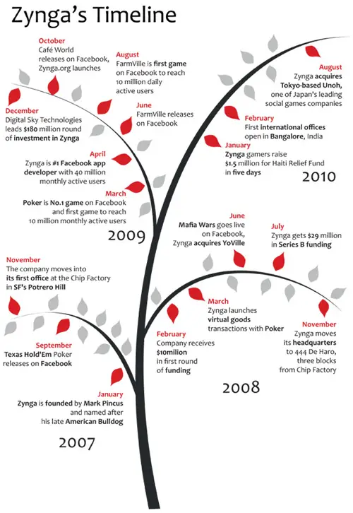
The colleagues over the Blog Herald analysed the complete Zynga platform and returned some amazing numbers in a great infographic. The startup which was only launched in 2007 is said to be making north of $1 million per day already and has not stopped growing. With more than 360 million players, Zynga has grown to become one of the major players online.
How did the platform grow this fast?

The view the complete analysis of Zynga, an infographic created by Infographiclabs, head over to The Blog Herald.

Filed Under: Games, Internet, Social Networks Tagged With: Infographics, The Blog Herald, Zynga

Google’s History: The Timeline of The Search Engine

August 30, 2010 by franky Leave a Comment

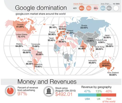
Our colleagues over at The Blog Herald once more sat down to research the data for another awesome infographic and analysed the history of Google this time. The result was Google History and Timeline. Here’s a preview for our Dailybits readers.

Filed Under: Search Engines Tagged With: google, History, Infographics, timeline

Shortest Hollywood Marriages Top Ten

August 18, 2010 by franky

The team of Infographiclabs created an infographic of the shortest Hollywood marriages for our sister site Celebrific.

Shortest Hollywood Marriages infographic

Filed Under: Funny Stuff Tagged With: Celebrific, Fun, Glamour, Hollywood, Infographiclabs, Infographics, Splashpress Media

The Visual Bible to Daily Deals Services: How Do Daily Deals Sites Work and How Do They Make Profit?

July 22, 2010 by franky 16 Comments

In the last two years one of the most popular phenomena online has been the rise of “daily deals services”. While the meteoric rise of Twitter has certainly been a more prominent phenomenon, an increasing number of exclusive service sites have started to offer “daily deals”. Unlike affiliate based or coupon websites, these “daily deals services” sites have a straightforward methodology, which is very profitable and logically constructed for consumers looking for discounted products.

In this infographic we have a look at what the biggest “daily deal services” sites do, which ones have gained most popularity and how they have achieved such viral success, along with analysis and comparisons between these main players.

With thanks to Infographiclabs for this visual guide to daily deals sites.

Filed Under: General Tagged With: 2010, Deals, Infographics

  • Go to page 1
  • Go to page 2
  • Go to Next Page »

Primary Sidebar

Privacy Policy

Copyright © 2023 · News Pro On Genesis Framework · WordPress · Log in